Dashboard for Aspen Conservation

Real-time Information for Limiting Deforestation

TIMELINE 3 weeks (March 2016)
ROLE Designer, Database Analysis and Researcher
TOOLS Sketch, After Effects, Excel


PROJECT

To design a digestible dashboard that provides information about critical areas for conservation in the Allegheny National Forest.

I was chose the Bigtooth Aspen, and was provided with a large set of data from three real-life surveys of moth damage on trees in the Allegheny National Forest conducted by researchers from the Carnegie Museum of Natural History. From this data, it was my task to locate problem areas where low tree-count appeared to be related to moth larva growth, and to research other problems facing Bigtooth Aspen health to visualize in the dashboard.


PROCESS


Data Analysis and Research: The first step for this project was to dive into the provided data. In a series of spreadsheets, with a wide variety of sites, trees and insect species, a story slowly became revealed.


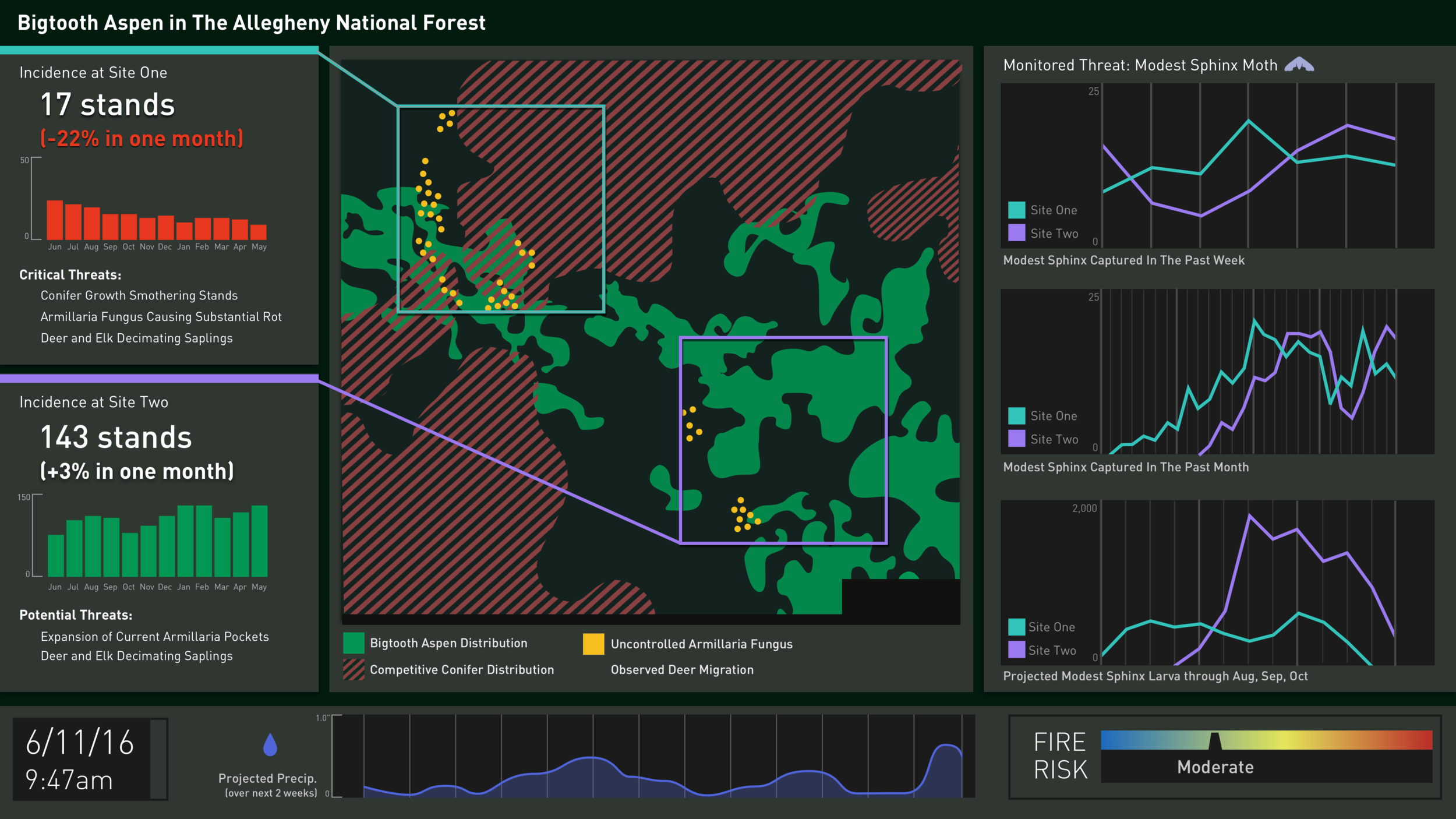
Although one site was showing signs of a link between moth growth and and tree loss, aspens on the whole were not particularly susceptible to larva grazing. In fact, Aspens are a very hardy tree because they reproduced clonally, sprouting "stands" from an often massive root system. This makes them resistant to many common threats, like forest fire and grazing. Through research, I found that their main weakness was actually conifer competition--once conifers took over the Aspen's territory, they would grow above them, essentially choking them from sunlight. Another threat was Armillaria fungus, which could rot out the root systems of Aspens, decimating them. For this reason, a central part of my final dashboard was a map that monitored encroaching conifers (seen in red stripes) and Armillaria fungus (seen as yellow points).


Sketching Iterations: The next step after data analysis was to put pen to paper and see different ways in which the data could be visualized and organized. Finding the right balance between elements was essential for a readable dashboard. Sketching out histograms, maps, bar charts, line charts and radial bar charts allowed me to see which techniques fit the data best.


Next, I started to create digital sketches in the vector-based prototyping program Sketch. I translated a couple of my hand sketches directly, experimenting with using photography as background and establishing a palette composed of muted earth-tones consistent with DCNR's forestry aims, while remaining clear from a data visualization standpoint.


Final Design: For the final design, I decided that the map should take a central position on the dashboard, allowing it to be the organizing principle around which the other data was arranged. This is reinforced by the frames delineating the two sites being directly connected and color-coded to the histogram and critical threat information to the left. The color coding also features into the moth growth line charts at right, with the relationship between the site and the data made clear by their aqua and violet coloring. I added a precipitation chart and fire alert because precipitation leads directly to more Armillaria fungus growth, while fires could potentially be helpful to Aspen stands, especially at site one, currently battling against conifer competition.


Animation: Using After Effects, I added animation that both provides staging for the viewer and alerts for critical information. When the dashboard is opened, the five main "cards" of information are established by dropping down in three-dimensional space. This clearly establishes the information presented, and how they are related is then animated by drawing the site frames from the "cards" at left, after which the line graphs at right are drawn, linking the color coded information together. Finally, the site one "card" pulses red, alerting the viewer there is a critical problem there, and the spiking prediction of larva growth at lower right also pulses red, highlighting a potential problem for site two through the late summer months. Click to see the animation below: