CMU Connect
Transitioning Incoming Students By Connecting Them With Current Students
TIMELINE 3 weeks, in collaboration with Apoorv Narang
ROLE Product Design, UI Design, Research
TOOLS Sketch, Illustrator, Photoshop, Keynote
PROJECT
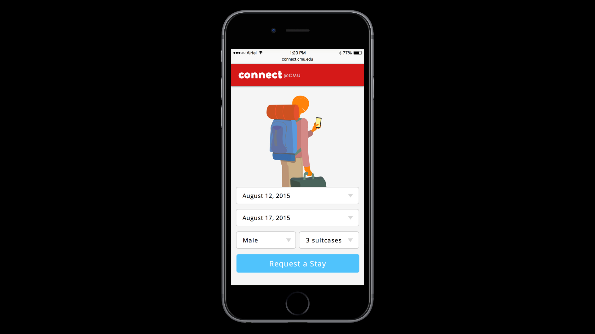
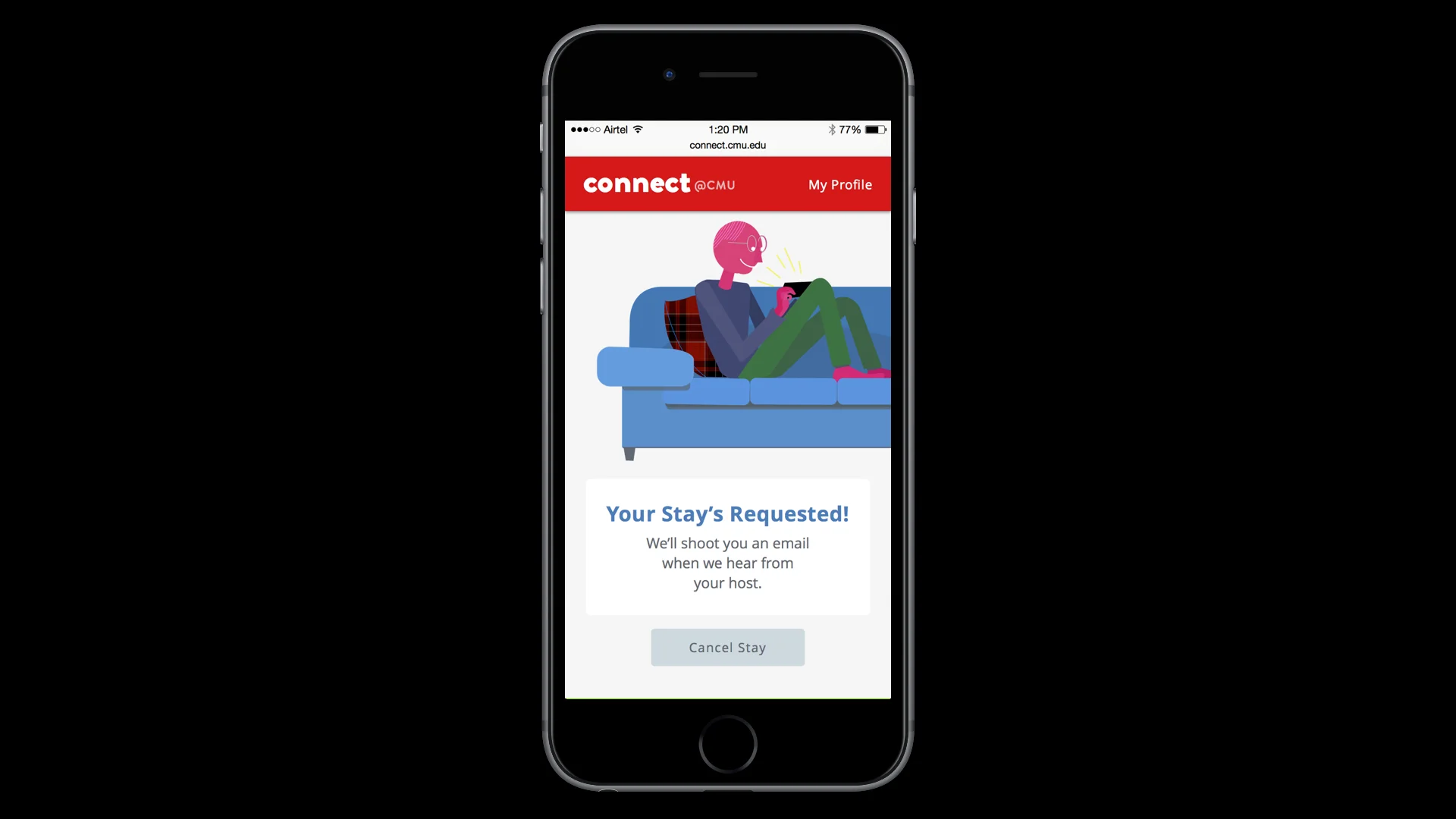
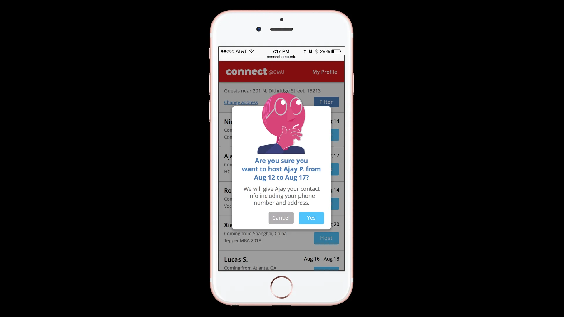
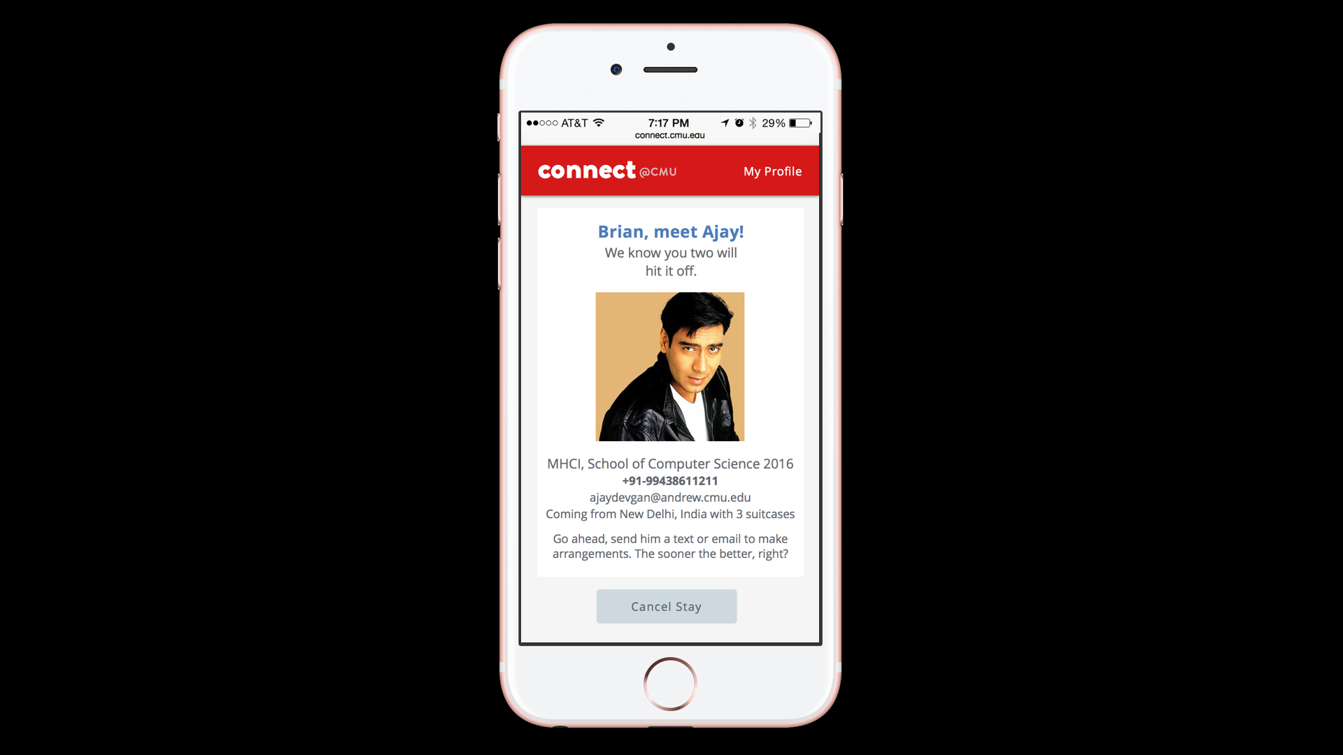
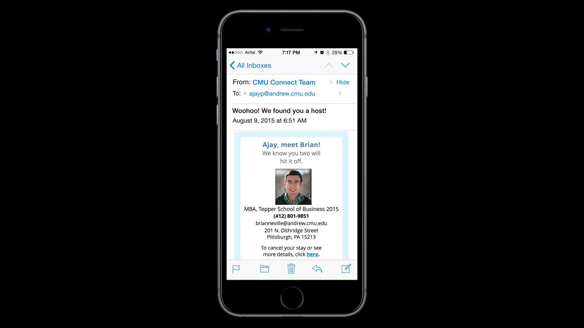
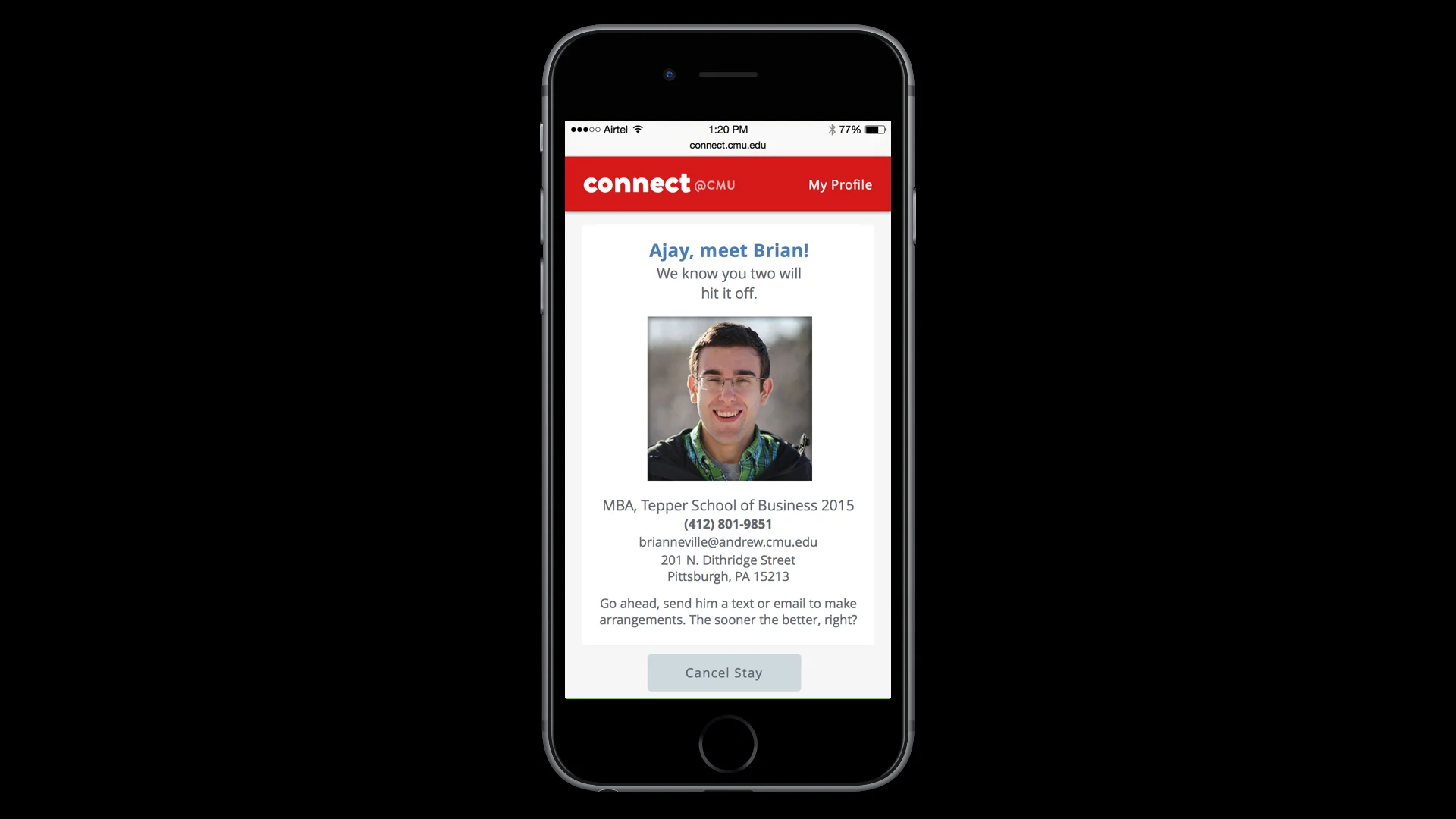
To identify and help pain points and breakdowns in the process of traveling to Carnegie Mellon University. CMU Connect is a mobile web app for incoming students to find current students who are willing to host them till they move into their housing.
Our user research showed that many new students do not have an apartment arranged before arriving to Pittsburgh, which caused anxiety and stress first thing. We aimed to address this problem by arranging free temporary housing with a current student, which also helps create new friendships throughout CMU.
PROCESS
Directed Storytelling: At the start of this project, we collected information from four Carnegie Mellon students who had recently moved to Pittsburgh to uncover the high and low points they experienced when relocating to a new city. We did this through directed storytelling, an interview technique that prompts the user to recount their experiences through open-ended questions. From this, we synthesized our findings by combining our interview notes on sticky notes and finding commonalities across the students' disparate experiences.
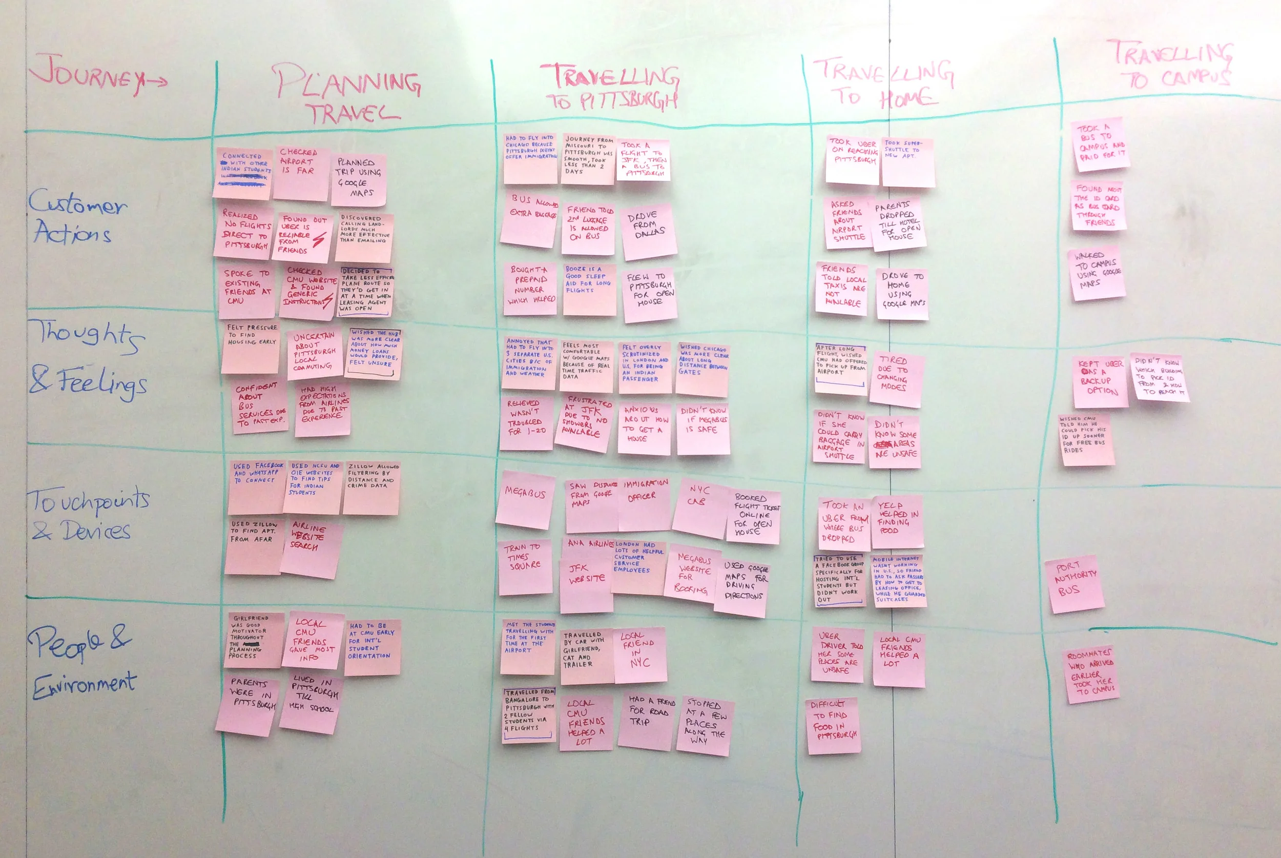
From this, we created customer journey maps, both of the process as it exists and how it could be improved.


First iteration: Our first concept for our mobile web app guided the incoming student through the three phases of transitioning to Carnegie Mellon: planning, travel and settling in.

We envisioned an adaptive, context-aware interface that would provide resources, feedback and crowdsourced tips for every step of the student's journey.

However, through critique and reflection, we realized Tartan Travel was a victim of scope creep: it was simply trying to do too many things. Many of the features we included were already being fulfilled through other sites and platforms. We scrapped the idea of an all-in-one journey assistant and went back to the whiteboard.
Pivot: We spent a time-boxed hour brainstorming possible solutions to pain points we had heard in our interviews, and came up with 26 ideas. We attributed which interviews these ideas stemmed from and then informally voted on what was most interesting and valuable.

A system for connecting students by providing temporary places to stay bubbled to the surface, and we were immediately intrigued by how it could scale to incorporate alumni in other cities. For the sake of this short-term project, however, we focused on one use-case: new students who lack housing or whose leases start at an inopportune time.
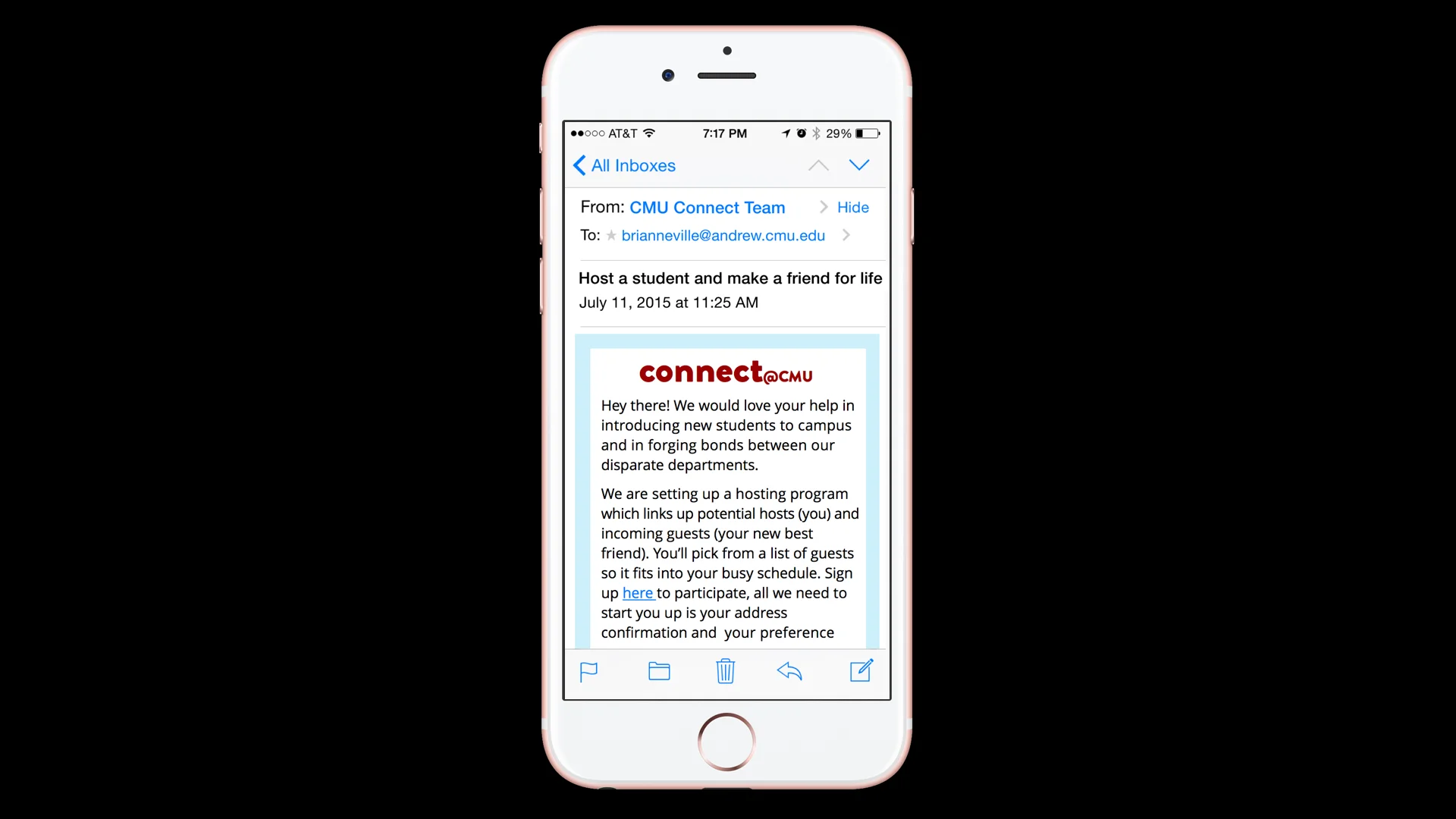
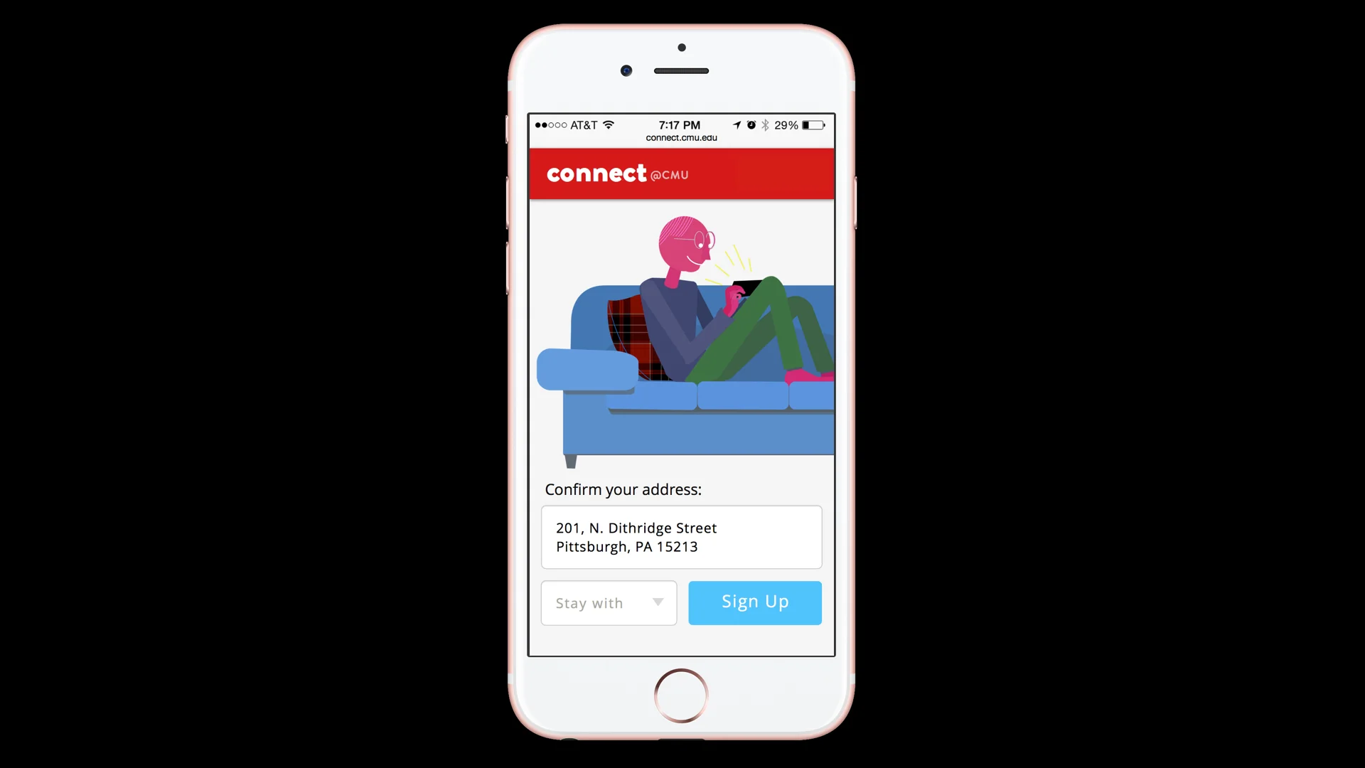
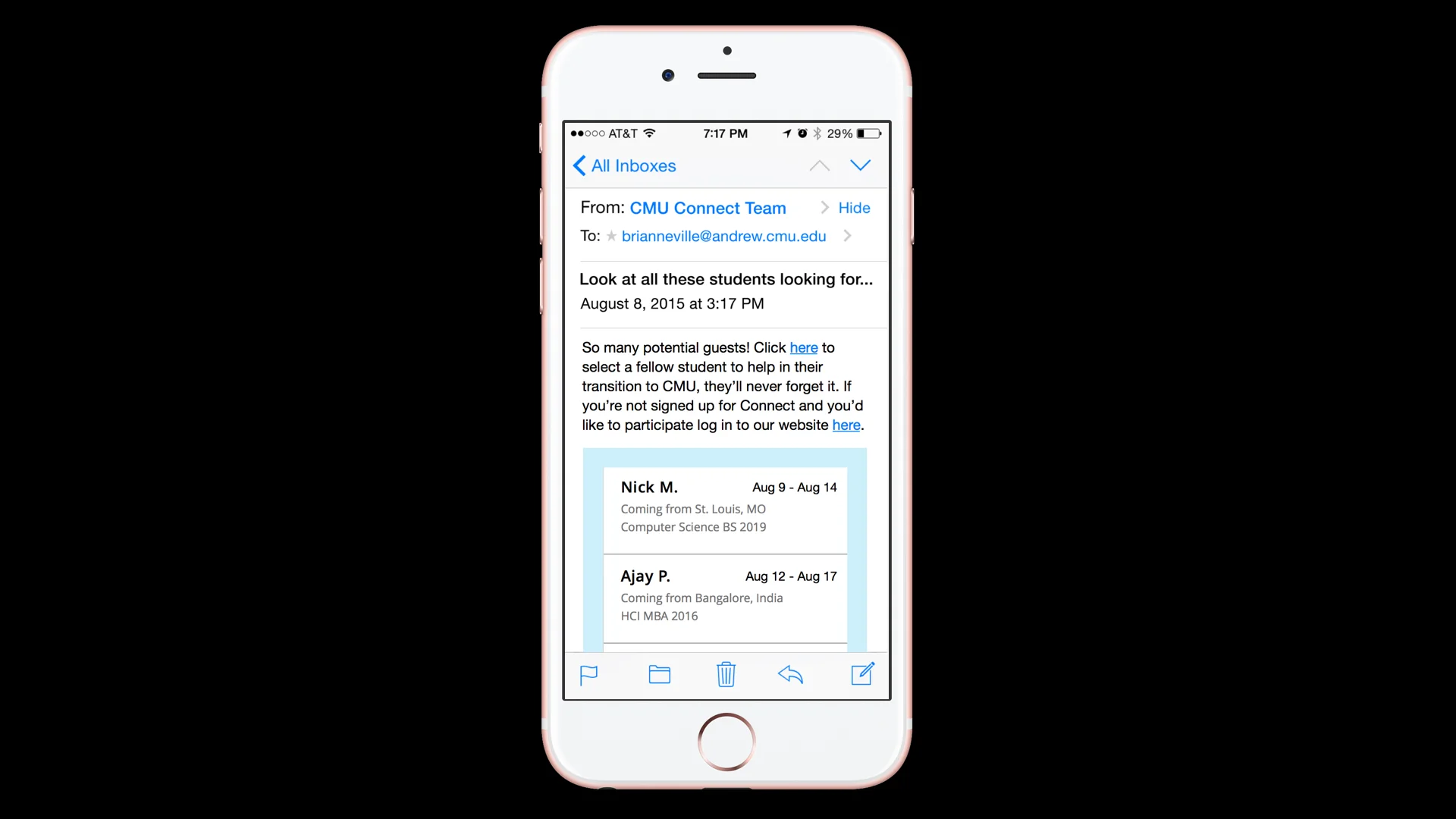
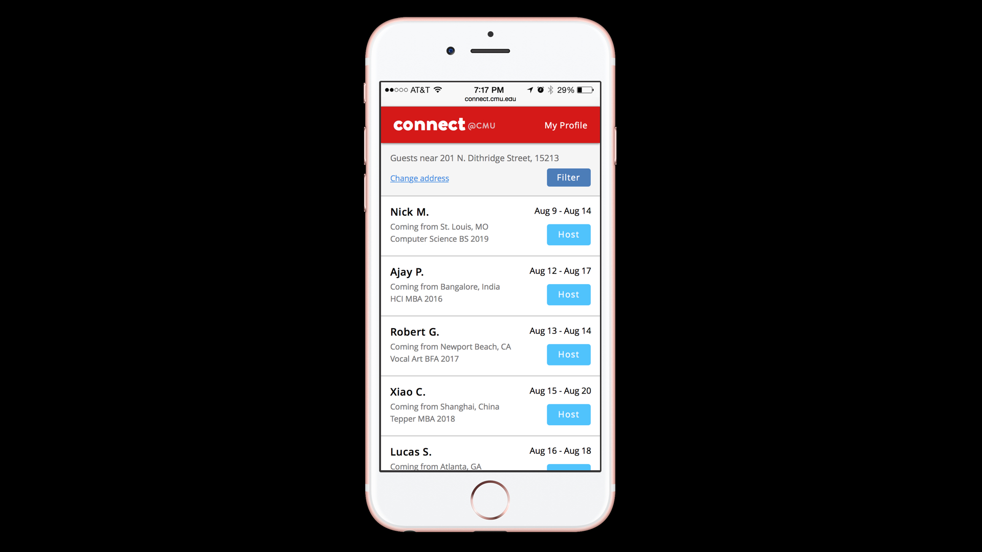
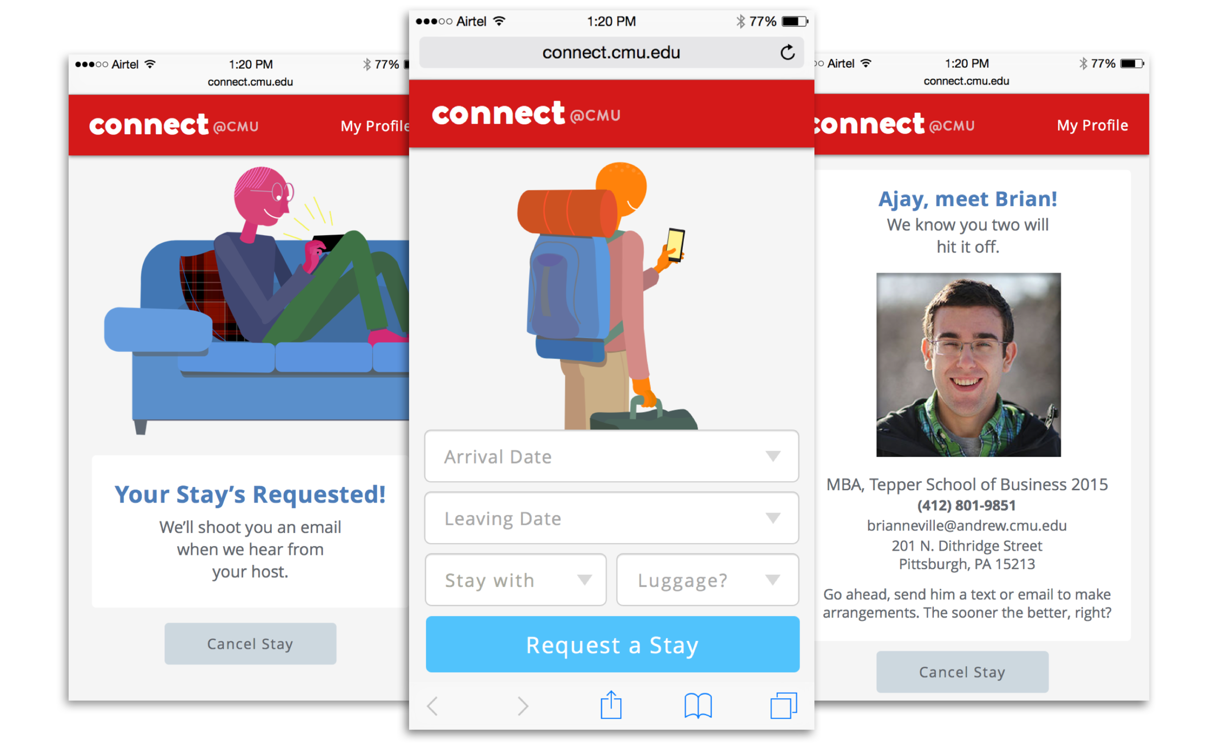
Flow and Wireframes: With a concept we were excited about in place, we set to work sketching the flow of the experience within the mobile site. Much of the communication throughout CMU Connect would be through email, so we made sure to incorporate those as touchpoints in our model.
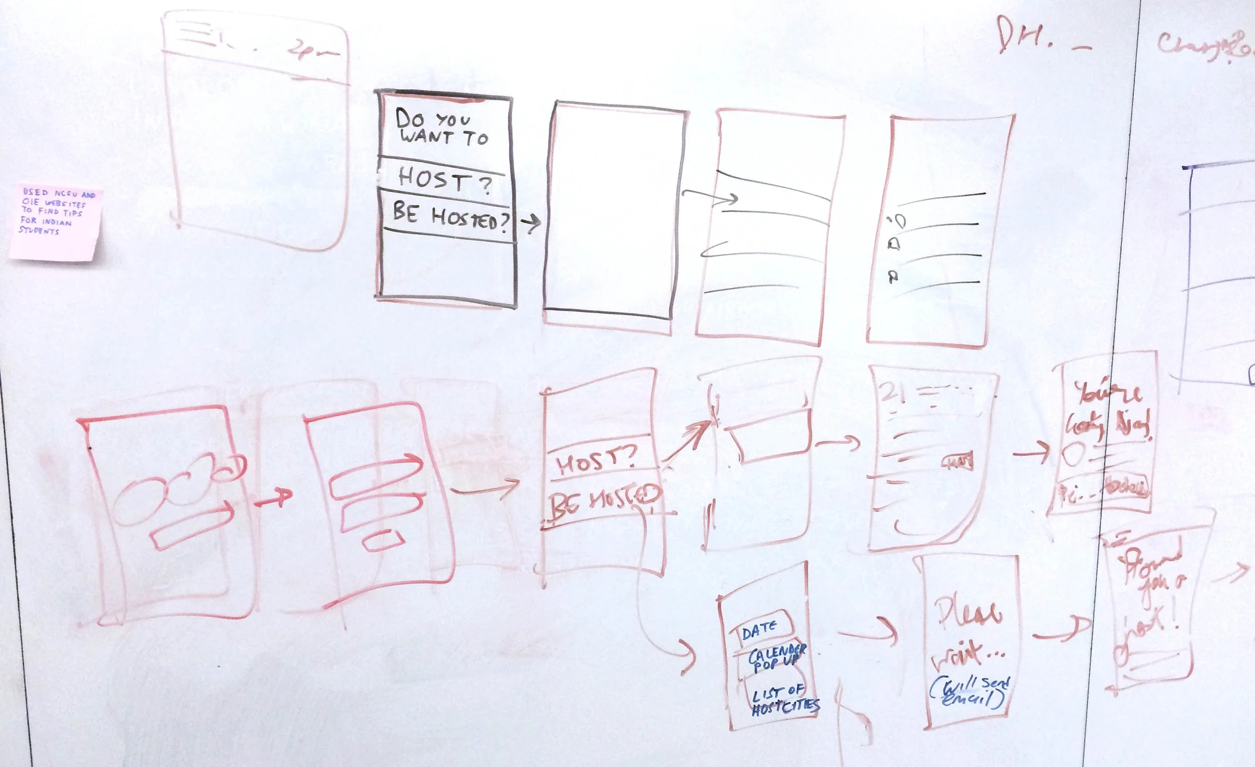
Once the flow was mocked up, we started on quick wireframes. Below, one of the earliest prototypes, where we still had a single portal for both hosts and guests. In the final design, these points of entry were split up.
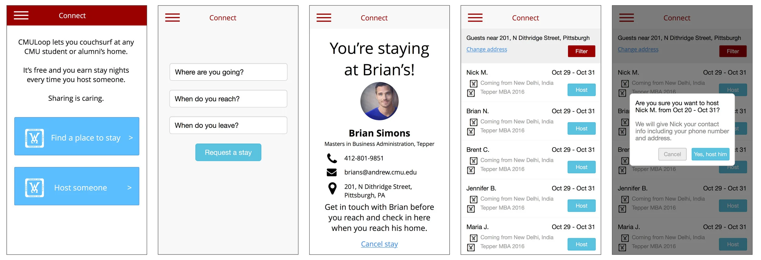
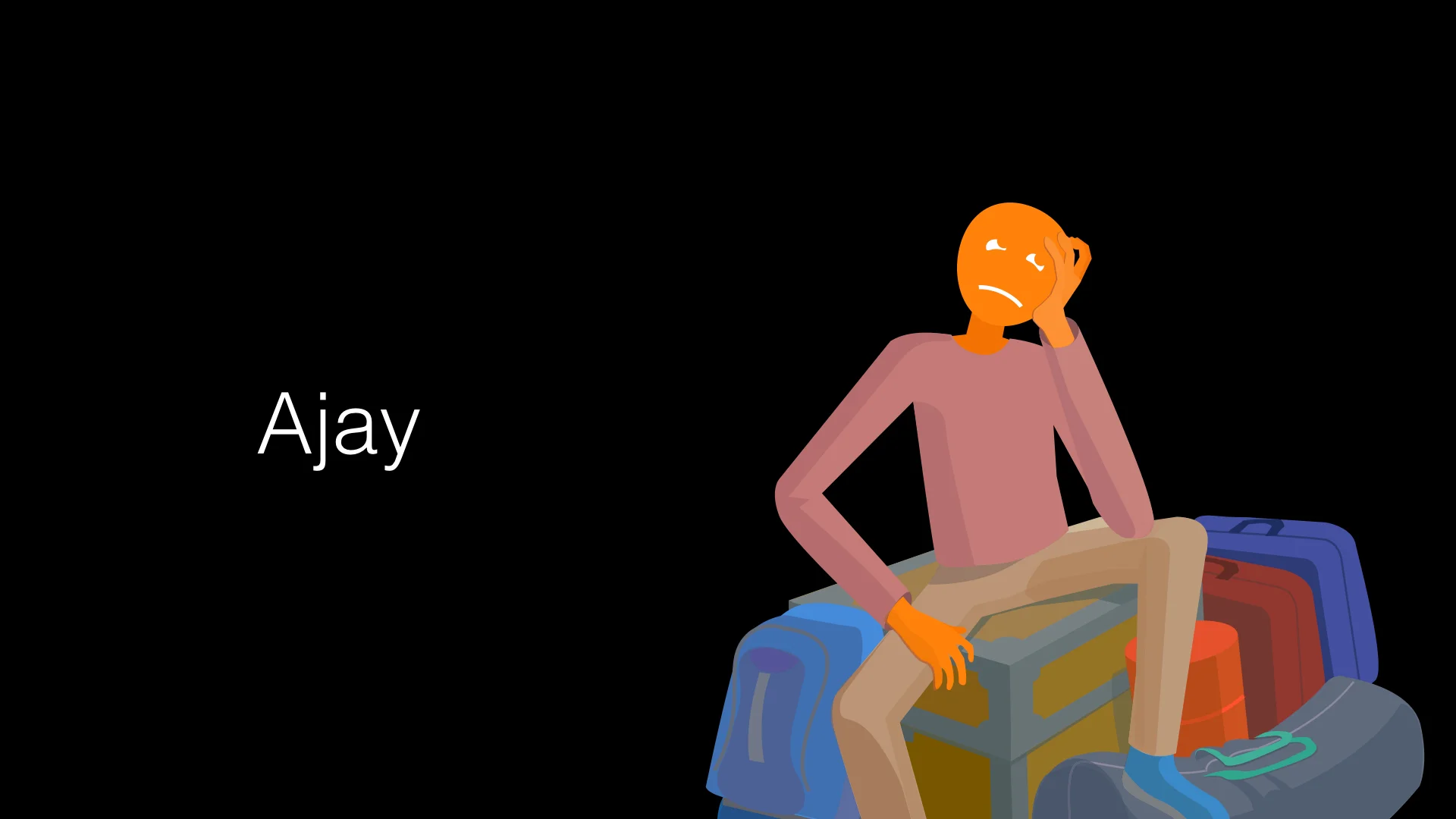
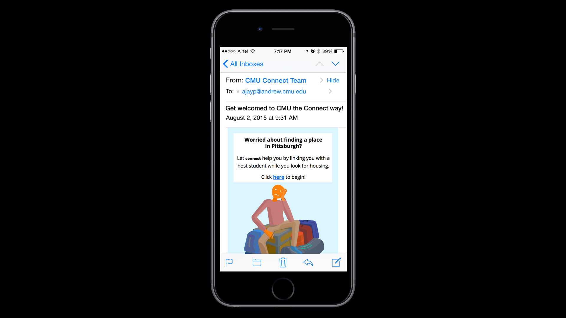
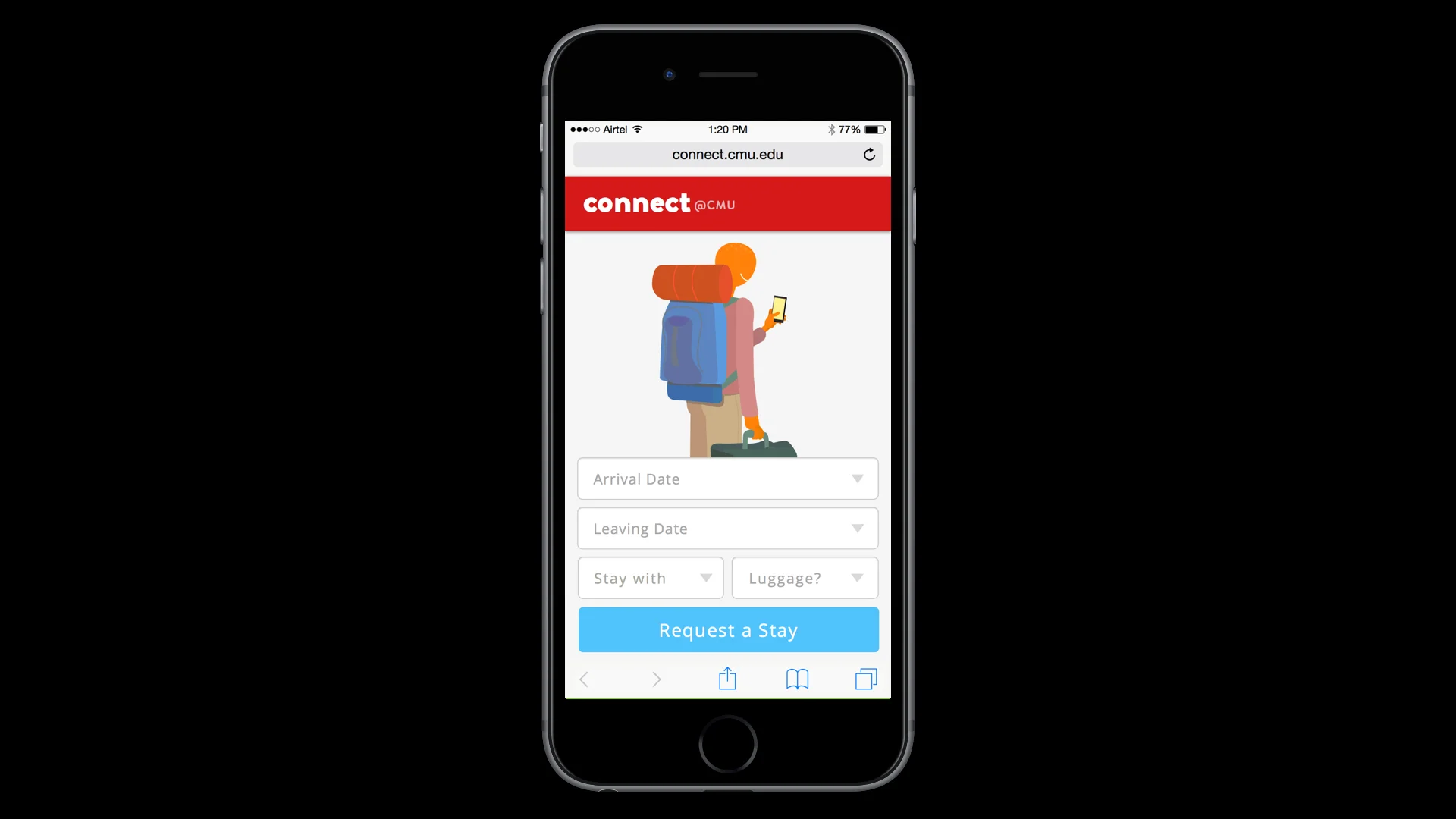
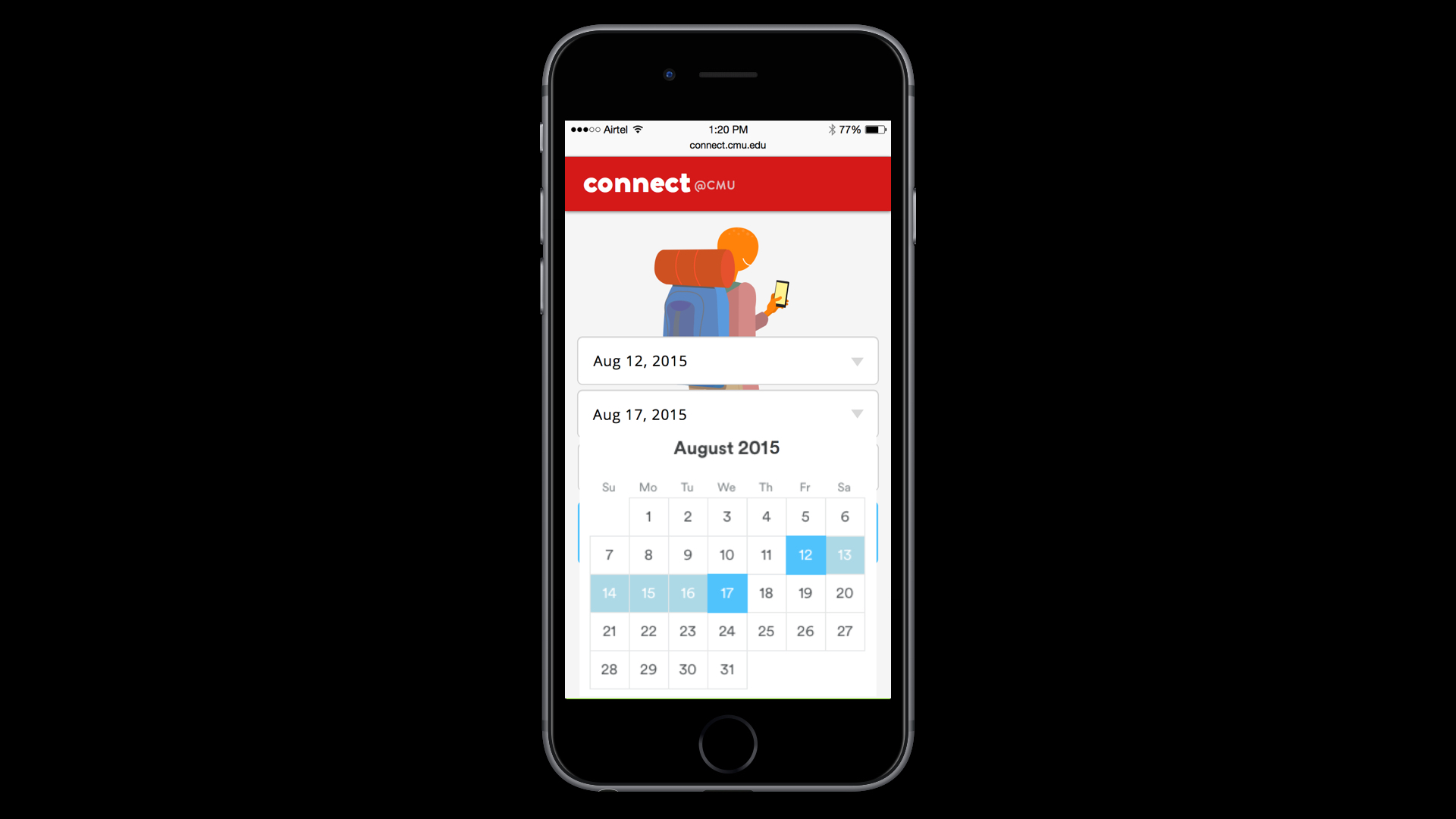
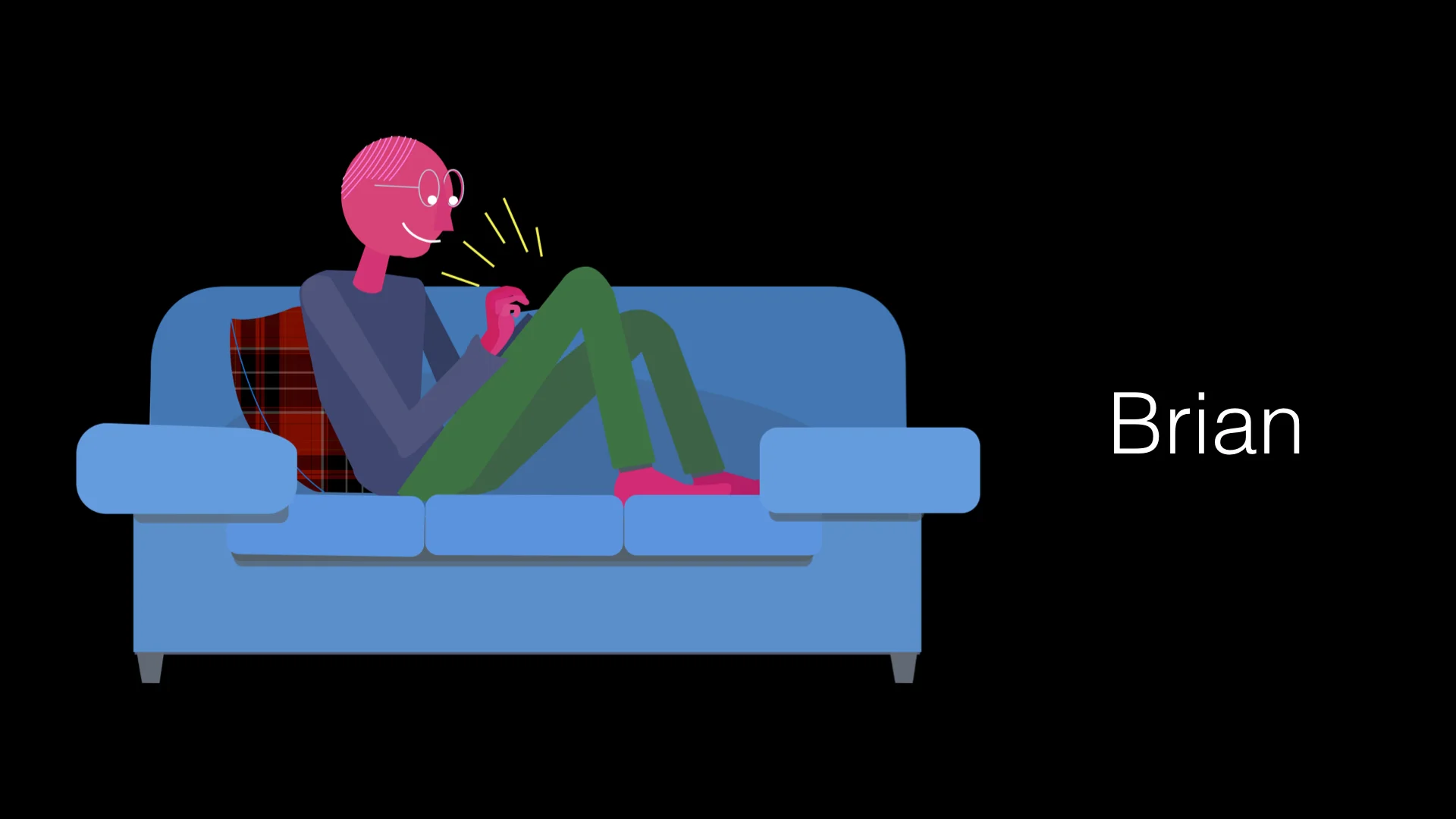
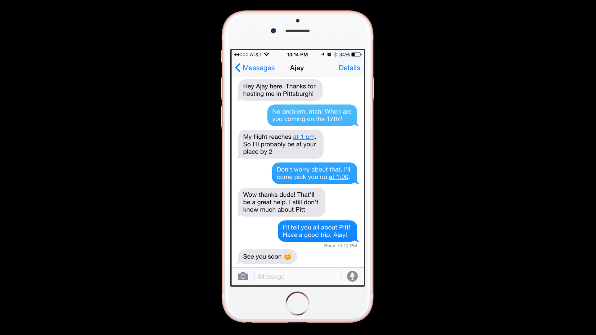
Final Design: For the final clickthrough we presented, I created illustrations to give the mobile site a fun, comforting look. Please see our final clickthrough below, which introduces our two personas, Ajay, our guest and Brian, our host, and presents a scenario of how the mobile site could be used. Hover over the images to see descriptions.